| Class | Property | Color token |
|---|
.bx--link | color | $link-01 |
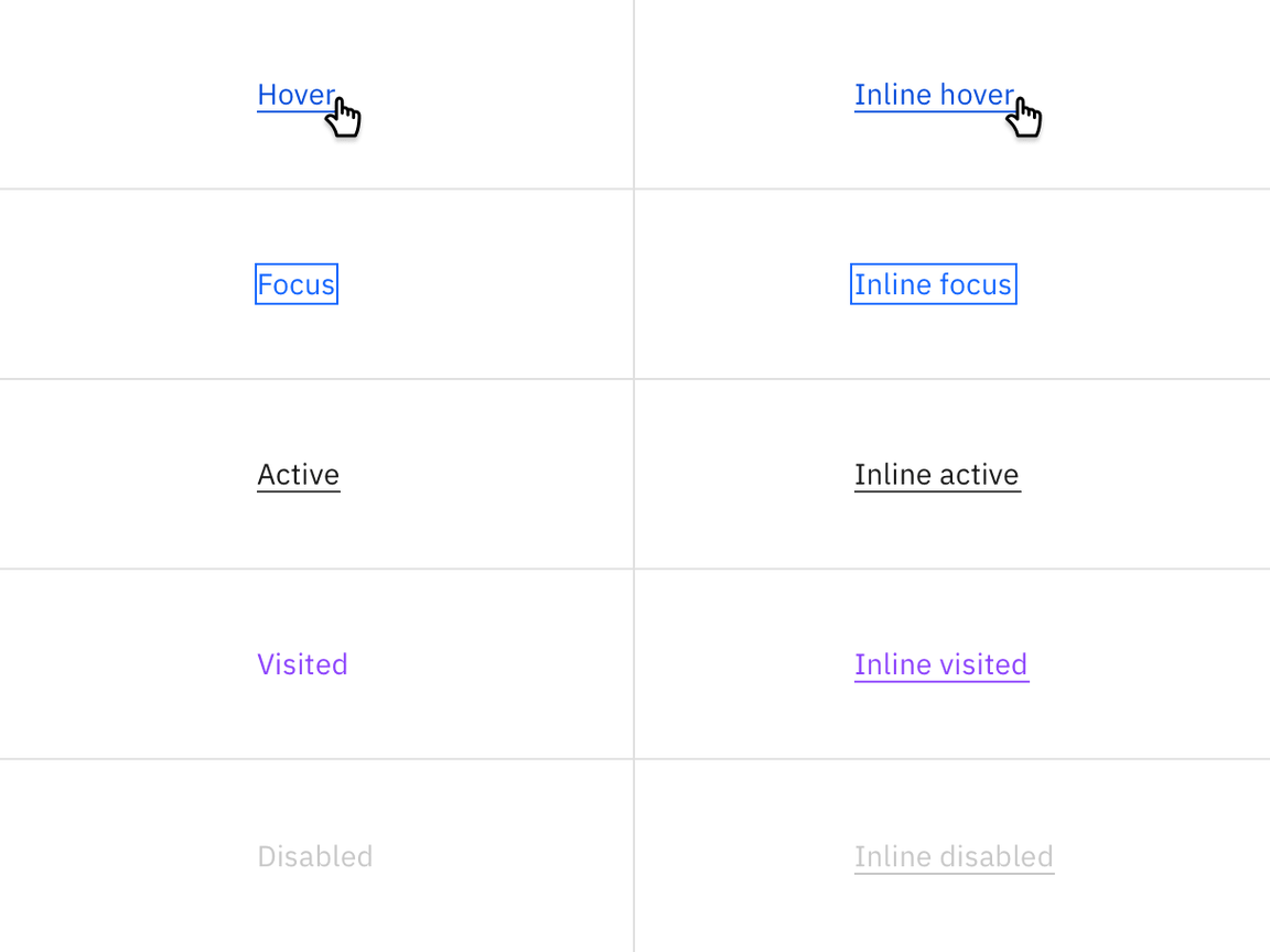
| Class | Property | Color token |
|---|
:hover | text color | $hover-primary-text |
:active | text color | $text-01 |
:focus | outline | $focus |
:visited | text color | $visited-link |
:disabled | text color | $disabled-02 |
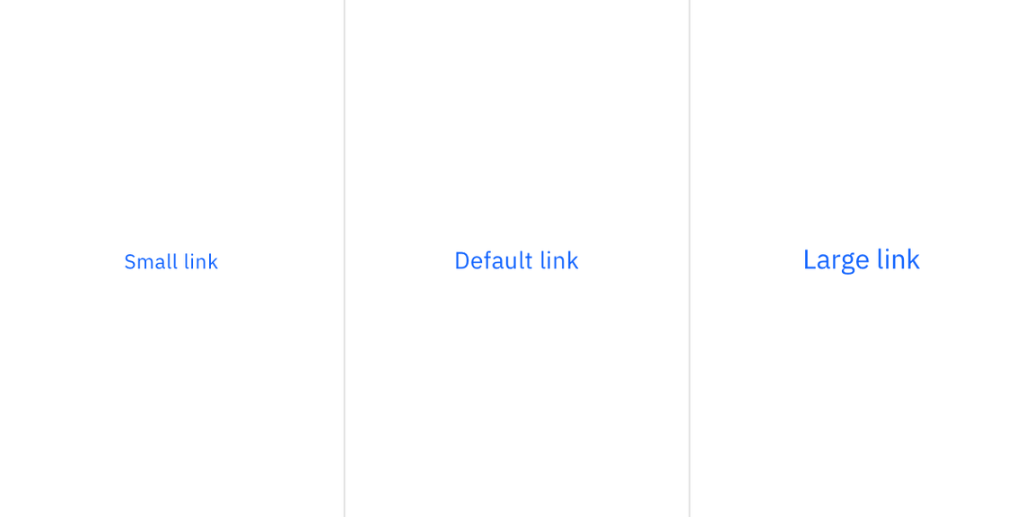
There are three size variants for the link component: default, small, and large.
| Property | Font-size (px/rem) | Font-weight | Text style |
|---|
.bx--link | 14 / 0.875 | Regular / 400 | $body-short-01 |
.bx--link--sm | 12 / 0.75 | Regular / 400 | $helper-text-01 |
.bx--link--lg | 16 / 1 | Regular / 400 | $body-short-02 |
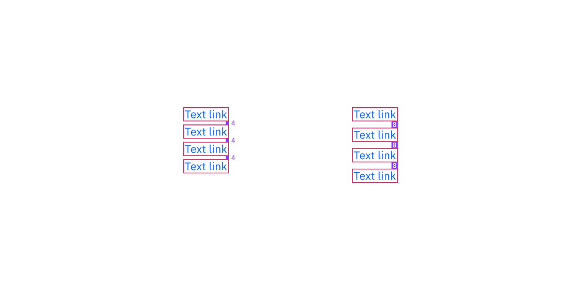
Links can be grouped horizontally or vertically. The following specs are not
built into the link component but are recommended by design as the proper
distance between grouped links.
| Class | Property | px / rem | Spacing token |
|---|
.bx--link | padding-right | 16 / 1 | $spacing-05 |
.bx--link | padding-bottom | 4 / 0.25 | $spacing-02 |
.bx--link | padding-bottom | 8 / 0.5 | $spacing-03 |
Structure and spacing measurements for Link | px / rem


